
grain of salt mag
✍︎
grain of salt mag ✍︎
grain of salt magazine is an online and print publication for non-men that aims to create a creative space that isn’t dominated by the male gaze. It was created by myself and four other friends who not only wanted a judgement-free space to exercise our creativity while in quarantine, but an opportunity to continue fostering our friendships in a new way as we lived indefinitely at different places in the country. The magazine aims to create a space that provides diverse creatives with a community that embraces imperfection and that will meet them wherever their capabilities may lie. If someone is not taken seriously simply because of their identity, grain of salt magazine seeks to reclaim that and wear it as a badge, or, more simply, gladly be taken with a grain of salt.
✎ 2020-2024
✎ Role: Social Media Editor, Social Media & Graphic Design Mentor, Creative Director
branding

I have been involved with grain of salt since its founding and acted as the first graphic designer and social media editor. One of my first tasks on the e-board was to design the magazine’s branding.
I used a hand-done bubble type for the primary logos to make the magazine approachable, as well as stay in alignment with the magazine’s effort to embrace imperfection and promote a more DIY feel. The magazine’s primary color palette features vibrant colors that convey the fun, carefree environment the magazine has created and also creates very interesting color combinations are used across assets. The magazine utilizes orange as its main color because it is a loud, fun color that encapsulates the magazine’s mission to create a space that is unabashedly imperfect.
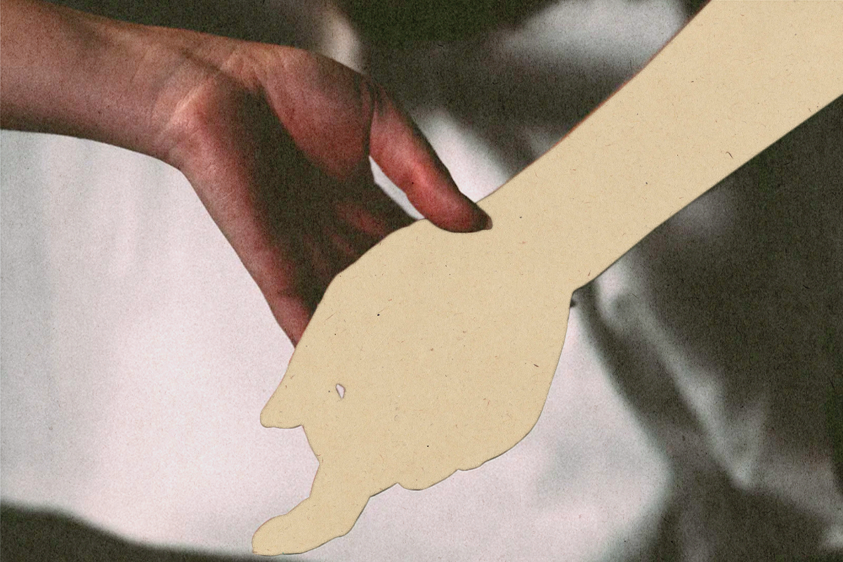
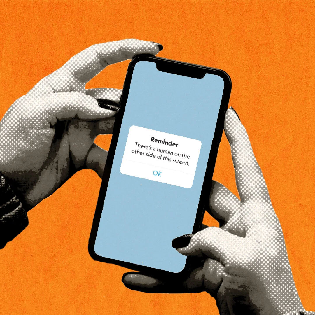
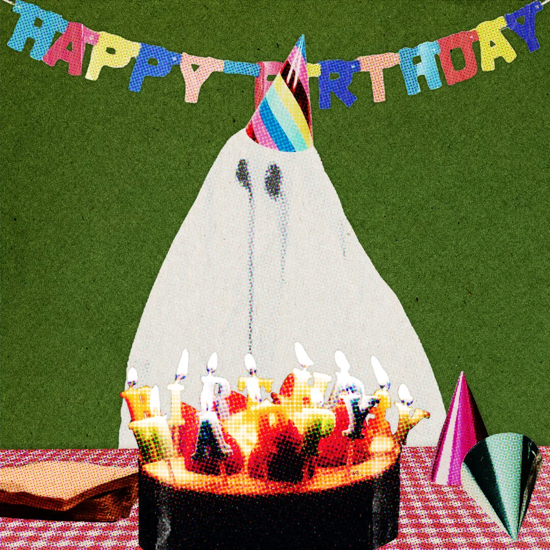
graphics
At grain of salt, I act as the current creative director who oversees a wider graphic design team in weekly assignments for both editorial and social media. Below are a few of my favorite pieces I’ve made to accompany articles and social media posts.


print editions
grain of salt has been lucky enough to have published special online and print zines in addition to online articles. Below are all of the special editions that have gone to print that I have assisted in organizing or designing!

best of 2020
Our first print edition, best of 2020, was created to collect our favorite published pieces to create our own little time capsule of the mag’s first six months. part of the proceeds of the print issue will go to the people’s bodega, a mutual aid fund providing essentials to new yorkers involved in the fight for abolition.
As a designer on the team, I helped allocate layout assignments to our team of designers, workshop designs with them, and put the final product into print.
spring 2021 residency zine: through the kaleidoscope
At the end of our second residency program, the grain of salt residency mentors and mentees worked together to create an online zine that acted as a final project for our developmental residents.
As a graphic design mentor, I worked with my mentees to design the entire zine front to back!


frozen adolescence
For our second print edition, we wanted to explore the idea of coming of age during a pandemic, and the effects it had on Gen Z.
frozen adolescence is a time capsule of growing up and navigating young adulthood during quarantine this past year. it was a weird way to start growing up, and we got to hear some of our contributors’ experiences! we put together art and writing made during the last year, about the last year and everything in between! with each purchase, all proceeds will be donated to nyct’s COVID-19 emergency fund to benefit COVID-19 relief in new york city.
As a layout designer on the team, I designed the magazine’s primary logo, spreads included in the final print zine, as well as promotional social media assets.